How to create branded case studies with Prismic slices
As part of our recent rebrand from Erudito → Jellypepper, we also redesigned and rebuilt our website from ground up to better reflect our mission, values and focus.
Part of the reason for this total overhaul were the case studies. While we've had success in the past publishing simple and beautiful case studies with our Prismic and Gatsby stack, but they were pretty simple. We defined our schema with a couple of fixed areas: the hero, cover photo, main content then a footer.
Branding our Case Studies
The problem with that approach is that the "main content" we brushed over is the heart of the case study. We wanted to showcase things like conversations, features, image galleries, brand identity styleguides and a behind-the-scenes logo process which just weren't possible with the existing setup.
We also wanted each case study to do more than talk about the designs we created, the code we wrote and the videos we made. We want them to reflect the vibe of the company — to feel properly immersive when you're reading them — without conflicting with the rest of our site.
The Jellypepper brand, while headlining a bold coral, is designed for simplicity to sit well with all of our clients brands just like we work — fitting comfortably within the client's existing architecture.
Enter Prismic slices
This is where Prismic Content Slices come into play. Slices are a unique feature in Prismic that allow you to define a collection of reusable 'chunks' of content in a special section of a content type. These slices can be added, reordered, and removed when writing your page, essentially bringing the modular design ethos to content modelling.
What this means is that we can create rich, art-directed case study pages for every client that simply wouldn't be possible in a traditional CMS. And we can do it without coding new custom pages or resorting to a fragile WYSIWYG website builder setup.
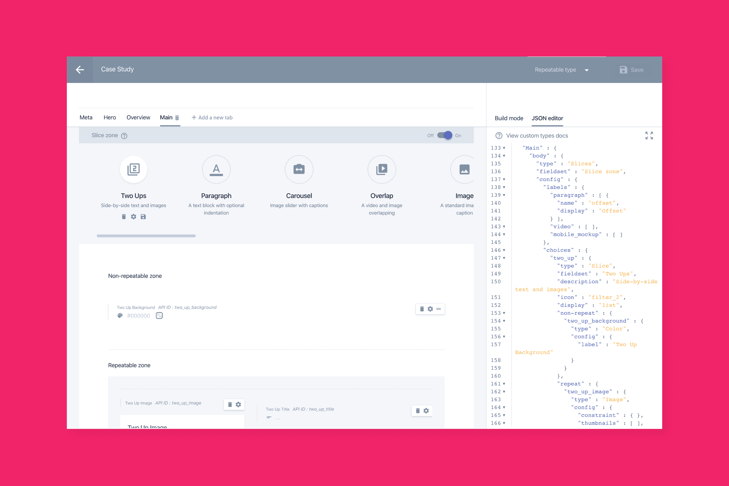
Modelling case studies with slices
All the content in our case studies is now composed entirely of slices. To model this in Prismic we defined a few standard fields that all case studies share, like project name, hero and thumbnail images, project URL, completion date, and brand colour (we'll touch on this soon). The body of the case study is a slice zone, with a large library of slices for everything from simple rich text sections, to image carousels, colour palettes, user personas, website mockups, and more.
Writing a new case study is then just a matter of adding slices and arranging how we want.
Mapping slices to components in Gatsby
Every slice we defined in Prismic has a corresponding React component in Gatsby, with the content fields in the slice mapping to props in React. This extends the modular content of our new case studies to the naturally modular design of React and Gatsby, and allows us to compose deeply rich pages.
import React from 'react';

/**
 * Image component
 * Full width image callout with caption
 * @property {string} src
 * @property {string} caption
 */
export default function Image({ src = '', caption = '', className, ...attrs }) {
  return (
    <div className={className || ''} {...attrs}>
      <img src={src} alt={caption} />
      <p>{caption}</p>
    </div>
  );
}
Make sure you serialize rich text fields with prismic-reactjs to render them in React.
Querying for slices
Once we have our slices mapped to React components, we have to query for them in our Gatsby case study template. This is done using GraphQL fragments to fetch each slice's data conditionally, since any case study could use any number of different slices.
Slices are available on the body field of your content type, and each has a primary (single items) and fields (repeatable items) section.
prismic {
  case_study(uid: $uid, lang: "en-us") {
    body {
      ... on PRISMIC_Case_studyBodyContent {
        primary {
          content_copy
        }
      }
      ... on PRISMIC_Case_studyBodyImage {
        primary {
          image_src
          image_caption
        }
      ... on PRISMIC_Case_studyBodyCarousel {
        fields {
          carousel_image
        }
      }
    }
  }
}
The easiest way to put together complex queries like this is with Gatsby's bundled GraphiQL runtime, accessible at /__graphql on your development site.
Putting it all together
With our Prismic slices, React components, and GraphQL queries all setup, we can now put together a highly dynamic, art-directed case study template. We iterate over the fields of body, and use a switch statement to conditionally render each slice in our template based on its Prismic __typename. Then it's just a matter of passing the appropriate data fields to the matching React component.
{
  data.body.map(({ __typename, primary, fields }, i) => {
    switch (__typename) {
      case 'PRISMIC_Case_studyBodyContent':
        return <RichText render={primary.content_copy} key={i} />;
      case 'PRISMIC_Case_studyBodyImage':
        return (
          <Image
            src={primary.image_src}
            caption={primary.image_caption}
            key={i}
          />
        );
      default:
        return null;
    }
  });
}
Make sure you give each slice a unique key for React. The result is a page that renders our own custom React components with the content from our Prismic slices, in the same order they are written in our case study on Prismic.
Going further
Since slices are just React components in Gatsby, we can do some really neat things with them to further brand and differentiate our case studies.
Each of our case studies has a brand colour field in Prismic, which we use to customise the case study even further for our client's brand. We leverage CSS Custom Properties in Gatsby to do this, falling back to our own Jellypepper brand colour.
We use React's useEffect hook to update a --project-color CSS property once the case study has rendered. This variable is then used throughout our case study components for branding touches.
useEffect(() => {
  document.documentElement.style.setProperty(
    '--project-color': (data && data.colour) || 'var(--color-jellyepper)'
  );
}, [])
CSS Custom Properties are only supported in evergreen browsers, so make sure you either include a polyfill for IE11 or a fallback in your stylesheets.
Another way we further art direct our case studies at Jellypepper is by defining a background colour on every slice in Prismic. These background colours are then used as CSS backgrounds on sections in our Gatsby case study template, allowing us to emphasise whole sections of content on the page.

Prismic's slices, when combined with the power of React and Gatsby, allow you to create deeply rich and dynamic content that wasn't previously possible - the sky is the limit!