Case Study - Clipchamp
Growth-driven product design and design sprints for an online video editor.
Overview
Clipchamp is a Brisbane-based video technology startup focused on empowering the world's creatives. Their mission is to help everyone create awesome video content that's fun to create and gets your message across in an immersive way.
Anna from Clipchamp reached out to my agency — Jellypepper — to help improve various components of their video editing platform. While the first version of Clipchamp was visually appealing with its dark iMovie-like layout, there were a lot of issues surrounding user experience. Below is a summary of some of the improvements we made to the video editing platform over the time we worked with them.
Team Structure
I collaborated very closely with the Clipchamp team, often working full-time from their offices and using proximity to best facilitate a culture of learning, ideating and shipping ideas. Specifically, I worked primarily with a small, tight-knit growth team:
- Anna who was the Head of Growth (now Head of Product), who managed the strategy and product roadmap.
- 5 front-end and back-end developers on their side who we worked with closely for implementation.
- Myself on Product Design (including wireframes, visual design, ideation, user journey mapping, etc.)
Goals
This was an interesting project in that it was framed as product-led, growth-driven work. Rather than starting from the beginning and taking our usual holistic view of the entire product, we went deep on particular aspects of the product one by one with goals like:
- reducing drop-off rates between funnel steps
- reducing churn during onboarding and checkout
- improving retention after creation the first video
While it was different to work in very isolated views, I ended up producing some great designs and some really positive results.
Process
Working in a loose Design Sprint style methodology, each week we spent:
- Monday and Tuesday researching using primary and secondary data. Anna would start with a user problem and bring some high-level data to back that up, usually financial, funnel metrics, things like that. We discussed in detail all the events, personas, etc. that led to this moment. I went off and created a hypothesis of why this was happening, drawing insights from user behavioural patterns, feedback from customers then mapped it towards business goals, north star metrics and typical sales funnel metrics; etc.
- Wednesday and Thursday designing and prototyping possible solutions, discussing the pros and cons, consequences, how it would scale in the long term. If we had the time and capability, we would reach out to a small group of dedicated users and use a wireframe or early-stage product design prototyped in Figma and get their initial feedback.
- Friday presenting to the wider company (team of around 40 at the time), framing our thought process and insights, solution we decided on, then working with the development team on planning feature-flag or segmented implementation. We also covered last week's key growth metrics, LTC, CAC and some other benchmark numbers, as well as new user feedback and what campaigns they'd been running that week.
We typically tackled three broad categories of work:
- Problems: things that needed redesigning, currently resulting in suboptimal experiences
- Opportunities: opportunities that we had to improve a particular set of users' experience with the platform, including new features
- Tasks: core things that needed to be done
Work
Rather than jump to the beginning of the user journey, we decided to start at the end and work our way backwards — no point making a leaky bucket bigger. Final designs of what we worked on can be found on the Jellypepper case study but here, I'll dive into some more details around a few specific experiments, as well as the ideas and approach.
Download and Export
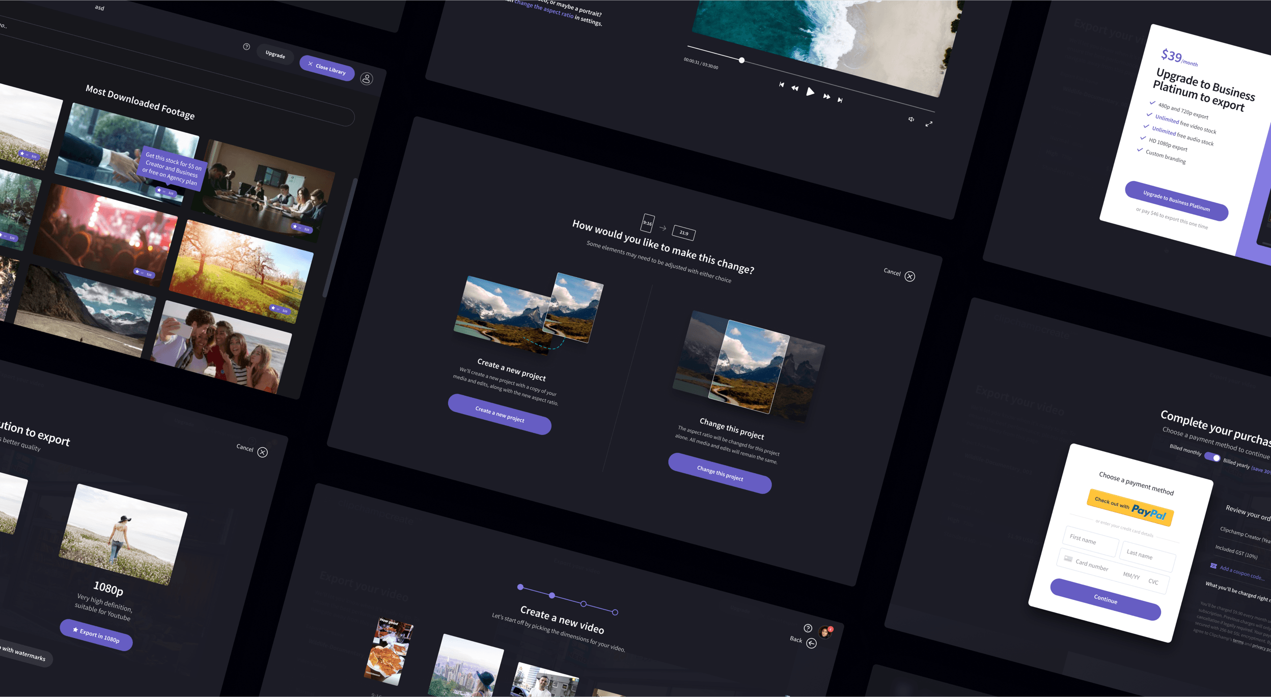
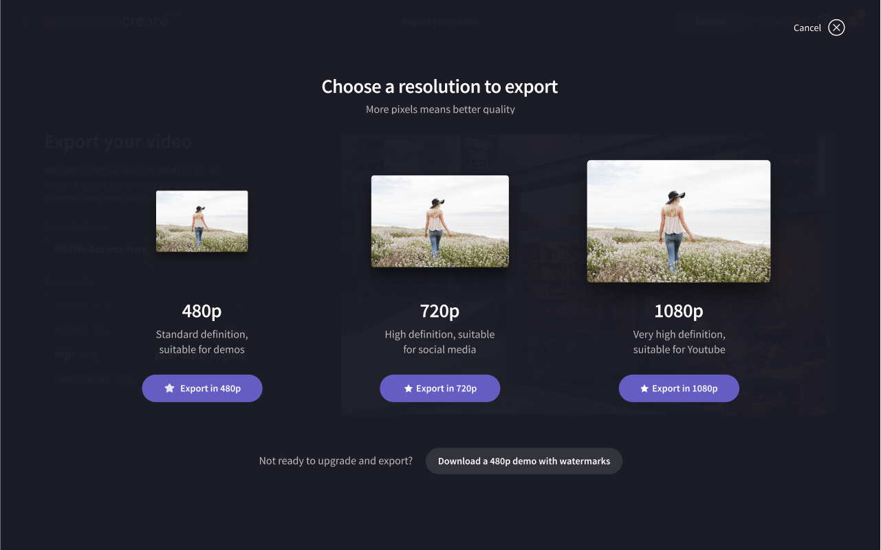
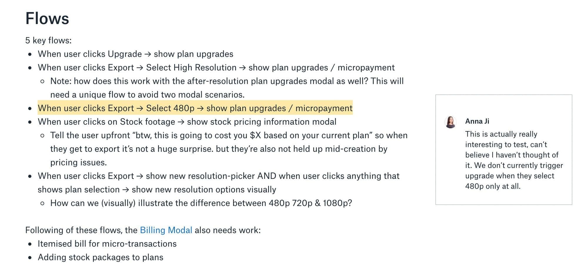
Once a user creates a video they love, they can export it. The previous experience was short, but confusing due to three key issues:
- Our non-tech-savvy users typically don't understand the differences between resolutions, including which one is best suited for their particular goal.
- Different resolutions were available on different plans, or available with one-off micropayments, which is difficult to convey in a dropdown. It's also possible to export in low resolution (480p) with a watermark, however this changes based on what plan you're on.
- Resolution is chosen after checkout, meaning you may have to go back and upgrade then restart the export flow.
To improve this experience, we transitioned the export process to a multi-screen flow. We started by opting to visually illustrate the different resolutions on offer with different sized thumbnails along with a description of where it's most appropriate. If the user selects a resolution that requires a higher plan, we can then show them pricing plans and upgrade process in the same flow. Additionally, there's a secondary CTA on the resolution selection screen that allows them to download with watermarks if they're not ready to upgrade.
We also toyed with the idea of adding an option for compression ratios (low, medium and high) but opted to figure that out automatically in the background for now.

Before
After
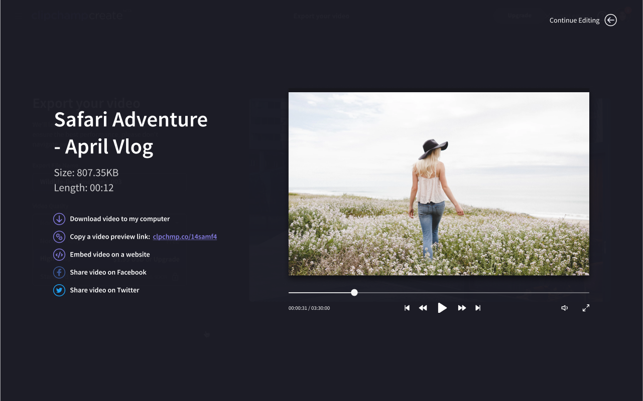
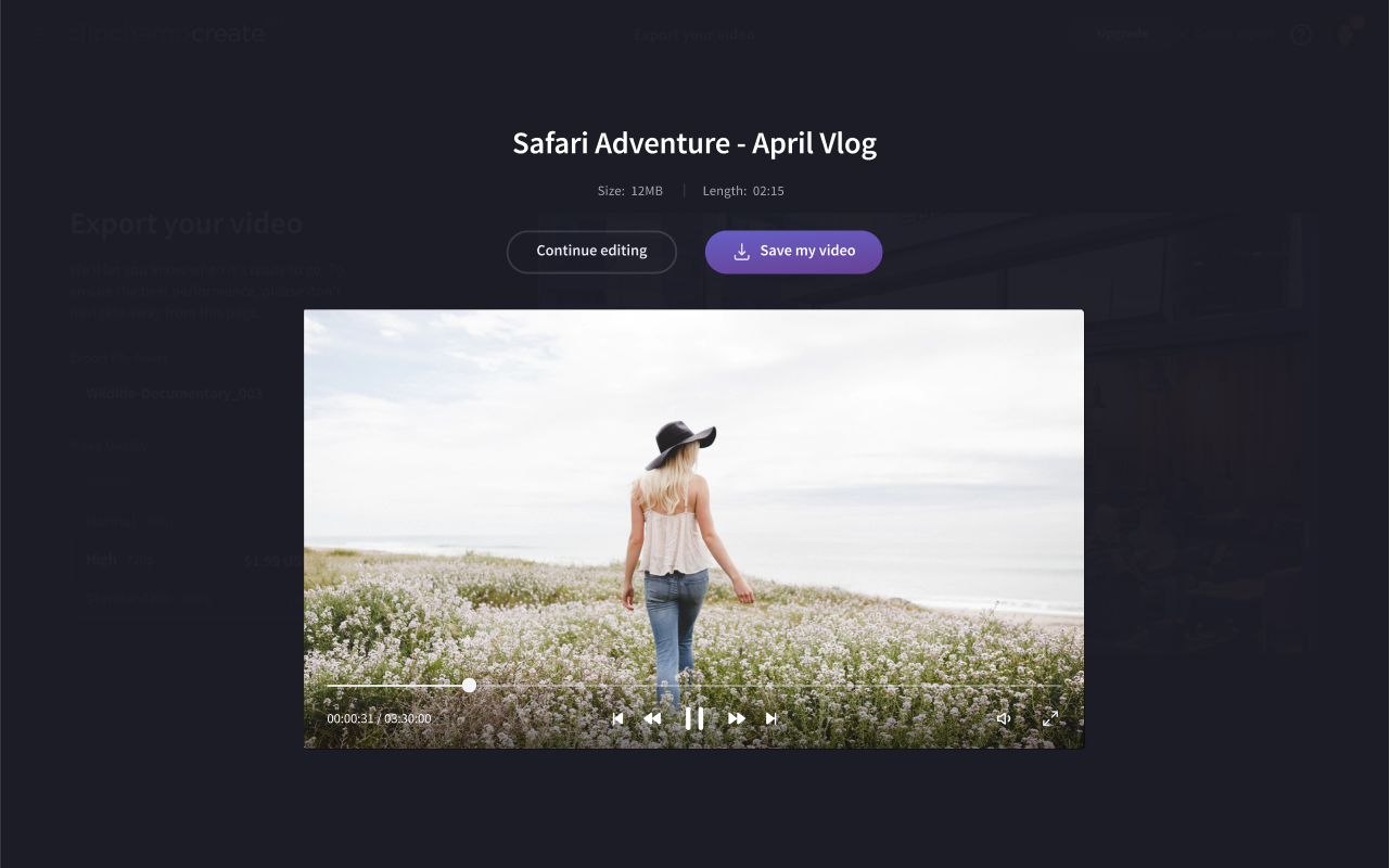
Clipchamp's download screen is the end of the typical editor-focused user journey. The user has created a video they're happy with, decided to export it and possibly upgraded, then landed here. We decided to add a few key features here to keep the user moving and give them more value from their exported video. Beyond downloading the video, we added the ability to copy a video preview link, embed the video on a website and basic social sharing.
Before
After
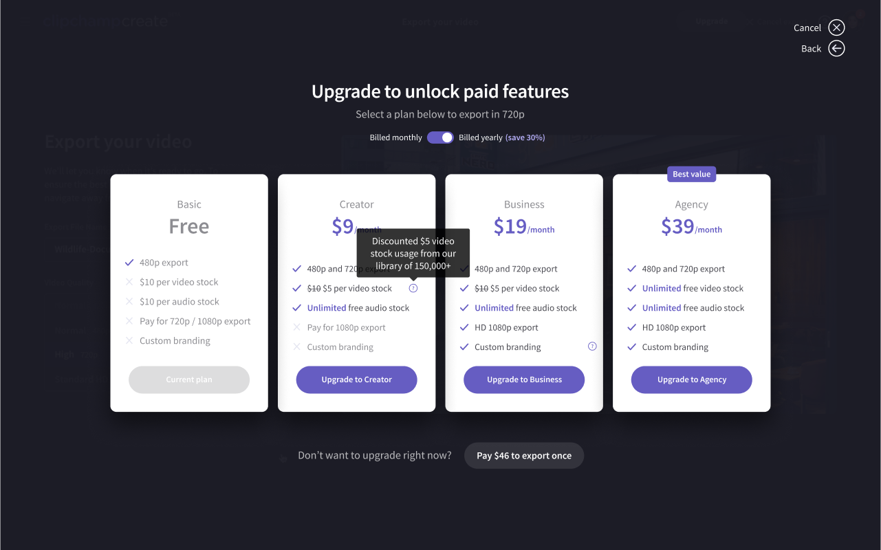
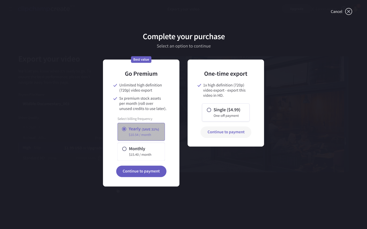
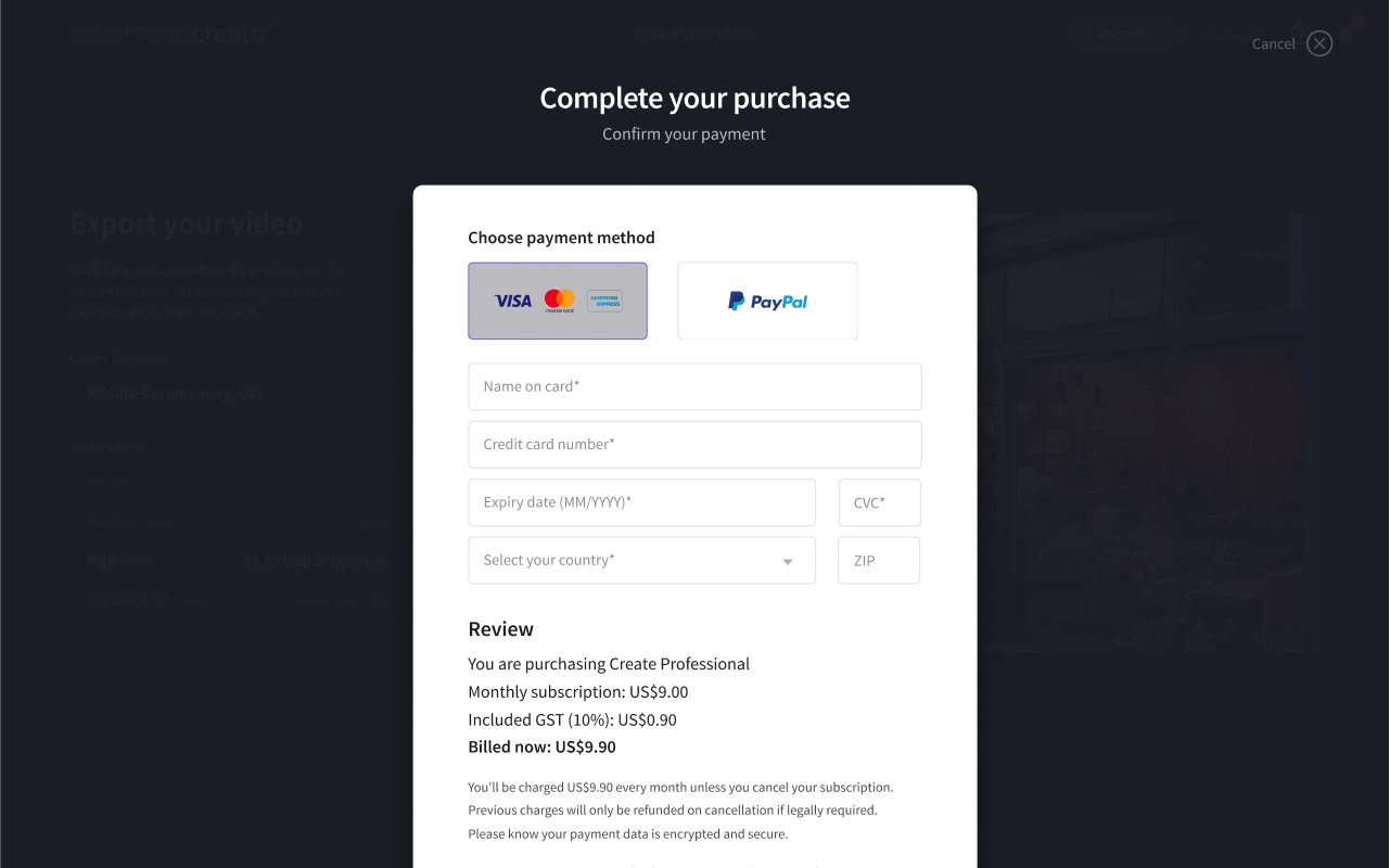
Pricing and Checkout
When a customer decides to upgrade or export their video, we needed to assist them through the complex process of committing to a plan (with optional upgrade packs) or opting to go through with a micro-transaction based on things like stock footage and resolution they want in their video. The goal for Clipchamp is to convey to their customers that paid plans are likely better in the long-run, but we had a few issues standing in our way:
- The variations in pricing plans, addons and microtransactions made the flow itself fundamentally confusing and complex, even to the Clipchamp team.
- The team wanted to expand their range of plans from a single "Premium" plan to a range of plans based on user archetype, namely Creator, Business and Agency.
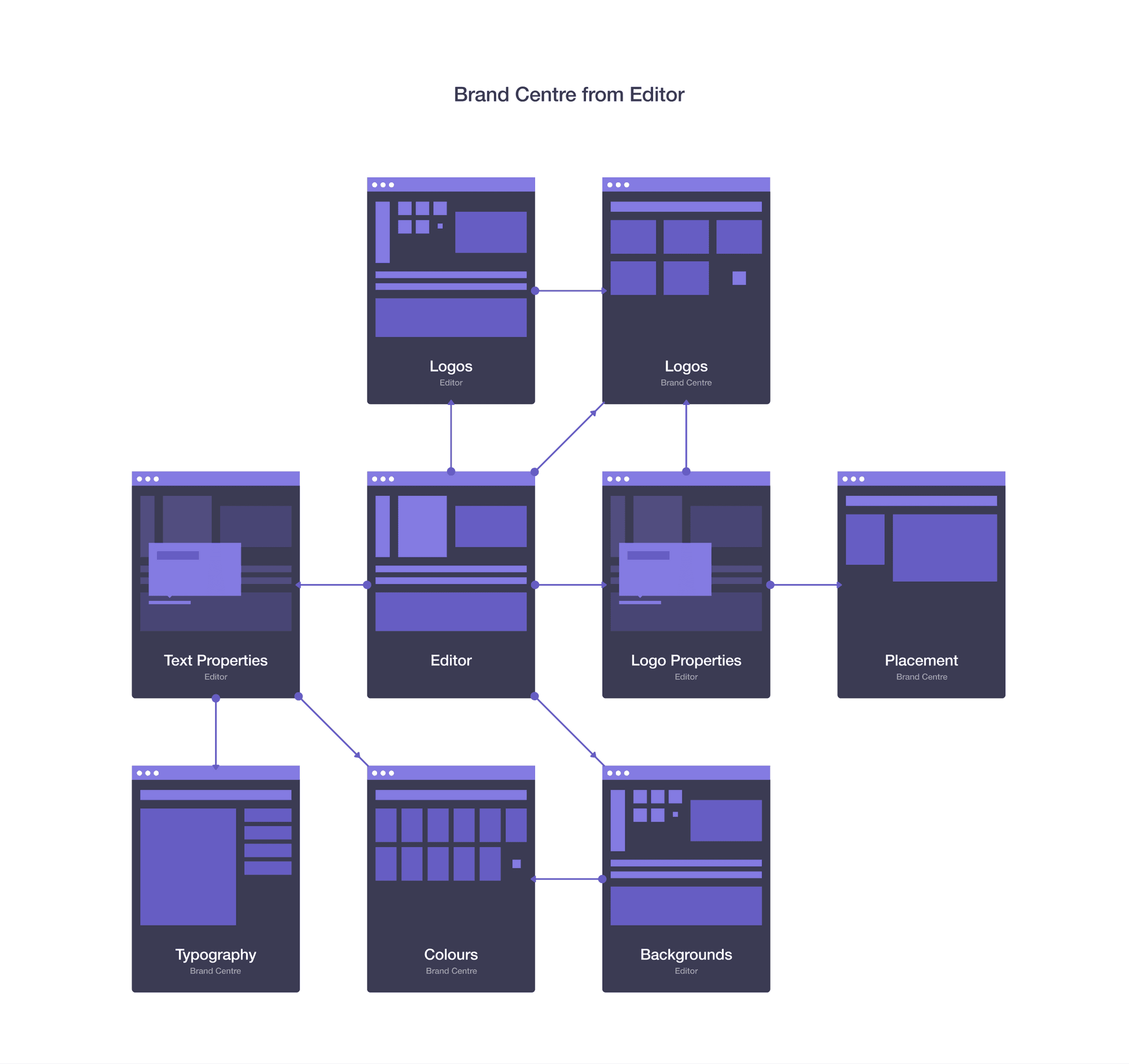
I started by figuring out all possible user journeys through the pricing system, pricing variants (stock packages, microtransactions), features (monthly / yearly toggles, stages of checkout) and identified problems. I then distilled these flows down into 3 key diagrams for the team, as well as an accompanying document describing all possible outcomes:
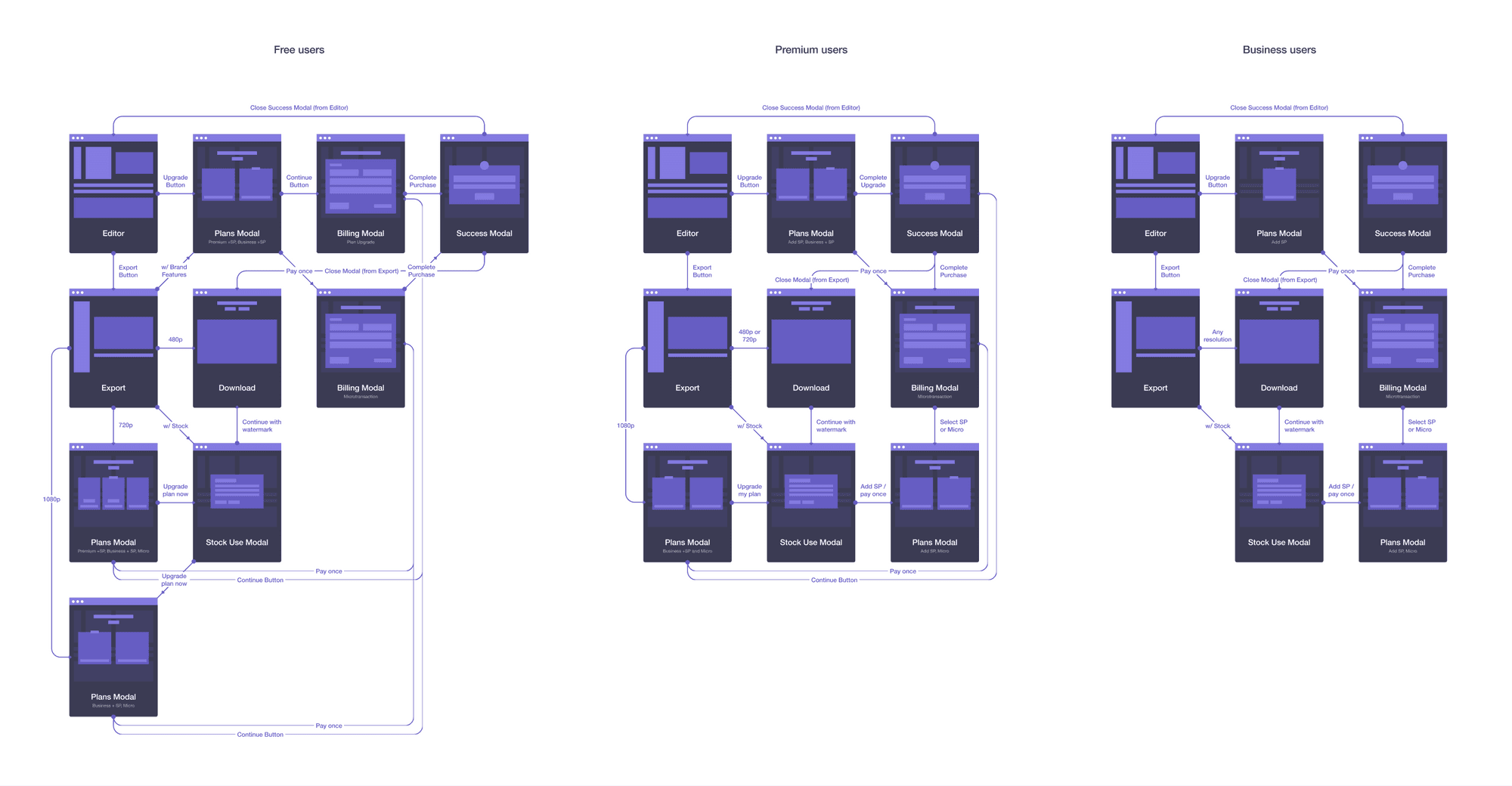
This surfaced some flows the team hadn't even considered...
This left me with more questions and opportunities than I started with:
- Could we visually represent paid features as additional upgrade triggers?
- When a user is on premium/business, we should retain the upgrade button now to show stock packs
- How do we convey that plans are likely cheaper than microtransactions?
- How do we show shop calculation for microtransactions... an itemised bill?
- How can we make the differences in each plan visually simple to the user?
- During the creation process, how do we ensure the user understands the cost associated and the choices they have?
- What are some UI changes we can make to signify premium (paid) content?
- Can we create a visual language for premium features?
After several rounds of iteration and testing with real users, we landed on a design that fit the bill (pun intended). We improved the content hierarchy by splitting the page into billing period → plans OR one-off transaction. Each plan featured the archetype name, dynamic price based on selected billing period and a list of key features you could compare easily. Additionally, we added tooltips to specific items to give the user a bit more detail around the change.
Before
After
Once the user had selected their plan, they landed at the Checkout, which immediately had some basic issues that needed addressing: the Paypal button being wrong, not storing card details, the sales team wanting to add a coupon field to the checkout, etc. To improve on the checkout experience even further, we decided to focus on an improving the content hierarchy, as well as adding an accompanying itemised bill and social proof from one of our loving users.
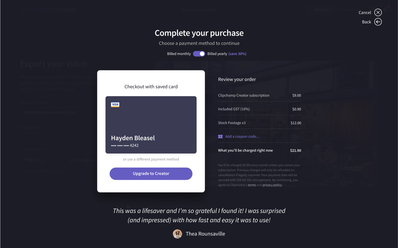
Before
After
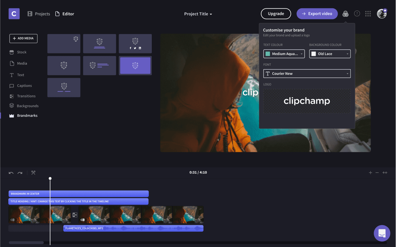
Brand Centre (New)
A huge focus for us was the concept of brands - adding your own colour palette, logos, fonts and other assets and rules to make professionally branded videos at scale and with a team. It had been a requested feature by many professional users, as well as enterprises and agencies. Over the course of five sprints, we took a lean, learning-based approach to Brand Centre, lining up calls with a few key customers to run them through interactive prototypes and get their thoughts before returning to the drawing board and re-evaluating our concepts.
We started with a few high-level, low-level and functional questions to spark our thinking:
High-level questions
- Is it possible to utilise all of brand centre without having to explicitly set up a brand?
- How many ways can a user be introduced to brand centre
- How can we show the benefits of brand centre intrinsically?
- Is Brand Centre for brand convenience or brand enforcement?
- Does Brand Centre live in the editor or as a separate entity?
Low-level questions
- How are these brand elements used in the editor experience?
- How do I know which features are “brand centre” features?
- If I select fonts in Brand Centre, does every video from now on “use brand centre” due to predefined typography options?
- Does placement work similar to this?
- How do we explain to users that these “shortcuts” are actually paid features?
- How can we allow users to select either predefined brand colours or choose their own and easily show which are Brand Centre-related and which are not?
- Do placements apply to just logos, or images too? Why not video?
- How does Placements fit as a “brand feature” within the scope of scaffolds, templates and layouts?
Functional questions
- What are the flows and scope of brand centre as a whole?
- What are the interactions between brand centre and the editing experience?
- How can we enhance brand centre under the same philosophy that the platform follows: making things easier to start and keep using (convenience) like Templates
- How can we make brand centre features / benefits more discoverable?
- Does brand centre need to be “set up” or can we design it more intelligently e.g. proactive / reactive brand creation (editor and brand centre work hand-in-hand creating a seamless experience)
Next up was figuring out the intersection between Brand Centre and the editor itself...
We ended up dividing Brand Centre into releases and building on user stories as we progressed, for example:
Release 1
- When branding my video, I want to place the logo in a logical and professional looking location, so my video will look good.
- When branding my video, I want to control what part of my video shows the logo, so my videos will make sense.
- When branding beyond the first video, I want to access my logo without having to upload it again, so I can save time.
- When putting in titles beyond the first video, I want to access saved settings easily such as typeface, font size, font colour, so I can save time and keep things looking consistent or on brand.
Release 2
- When branding my videos without a defined brand, I want to make my videos looking professional and consistent without having to know how to design or spending a lot of time setting things up, so I get gain trust from my customers.
- When creating videos beyond the first one, I want to have my prior settings saved as the default state, so I don’t have to spend unnecessary time.
- When my brand changes, I want to be able to update my brand settings, so I can continue to have consistent branding for new videos.
- When branding my videos, I want to be able to add animated preset blocks like intro and outro, so I can save time and make my videos look awesome.
Based on these user stories, we ended up with the following set of ideas:
- Logo Tracks: a single-item track, available in the side panel. Comprised of only the logo. Around this we'd need to allow uploading multiple logo variations (regular, silhouette, etc), saving and positioning using presets or free-transform.
- Fonts: the ability to upload brand fonts, extending the the in-built Google Fonts functionality. We should be able to upload a family of weights and variants, then collate them as a single typeface.
- Colour Palette: a collection of editable brand colours which can be applied to typography, slates, backgrounds and more.
- Start / End Slates: a fixed collection of elements as a single track item, available in one or more items in the side panel. Can be comprised of simple elements e.g. background colour / blur and logo, but can only be added to the start / end of videos.
- Brandmarks: flexible collections of elements as a single track item, available in the side panel. Can be comprised of call-to-actions, titles, subtitles, social media handles, etc. all with various layouts.
Onboarding
Before we started working on onboarding, only 30% of users were finishing videos due to “blank canvas fear”. The goal was to push this number up by at least 10% using a step-by-step guided approach to help users activate, as well as introducing templates — off-the-shelf collections of video, audio, text and transitions that make it faster to create a high-quality outcome. It was also a good chance for us to learn a bit more about the type of user we're helping and hopefully tailor their experience.
We addressed onboarding through two key methods: templates and updates to the video creation flow.
In Clipchamp, templates are essentially a collection of titles, stock video/audio and transitions in the form of a boilerplate project. They're off-the-shelf scaffolding you can use to speed up the creation process, designed to make it faster to create videos with higher-quality outcomes.
We introduced templates for the 30% of users who don't feel comfortable starting with a blank canvas (called "blank canvas fear"), designed to fit a variety of use cases by outcome (prospecting, event highlights, product demos), events (Christmas', birthdays, weddings), personas (restaurants, tech startups, banks) and platforms (Facebook, Instagram, Youtube).
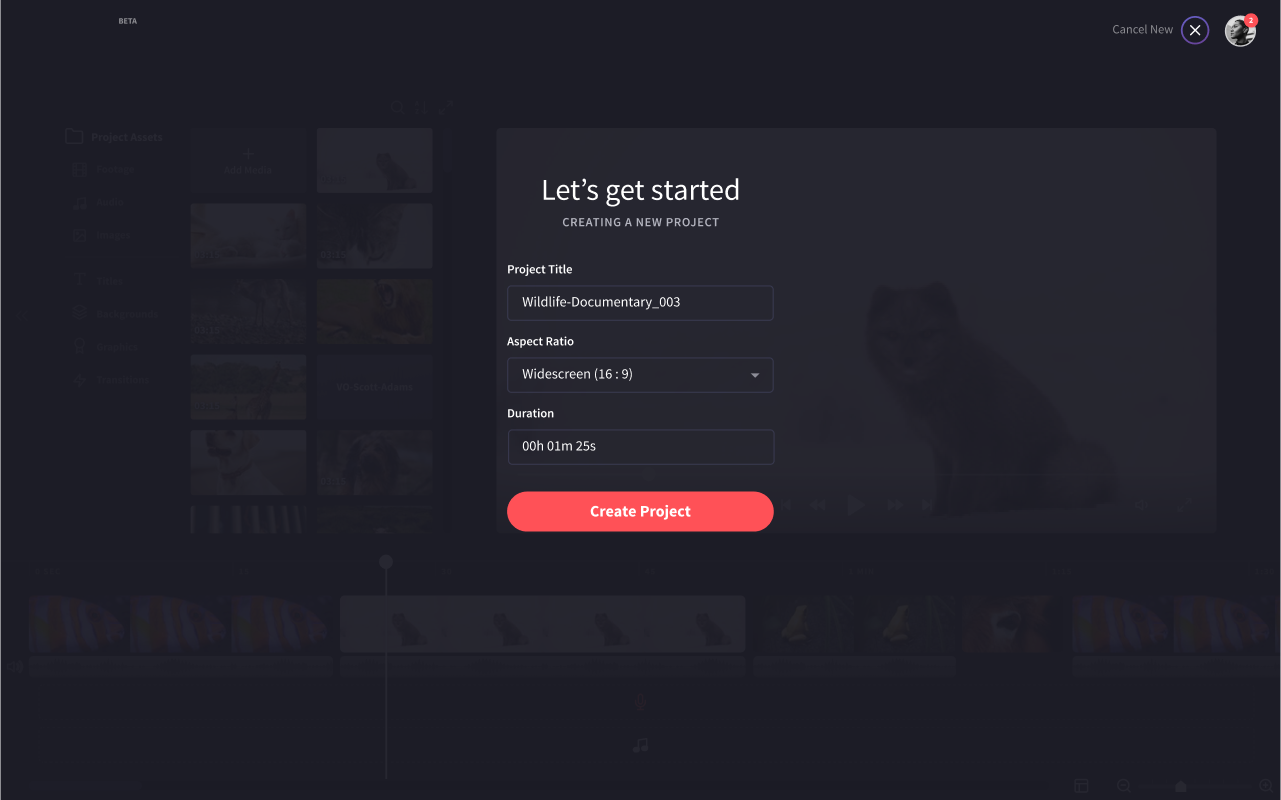
These templates then fit neatly into the video creation flow, which needed some love of its own. The previous design was simply a modal that asked you to select an aspect ratio, giving us a whole range of opportunities:
- Clarify some of the jargon around making videos, such as aspect ratios (classic, widescreen, HD).
- Ask the user what their goal is, how it should be themed and where they want to post it
- Offer templates or scaffolds that fit their needs
- Potentially even generate predefined template with supplied footage and audio
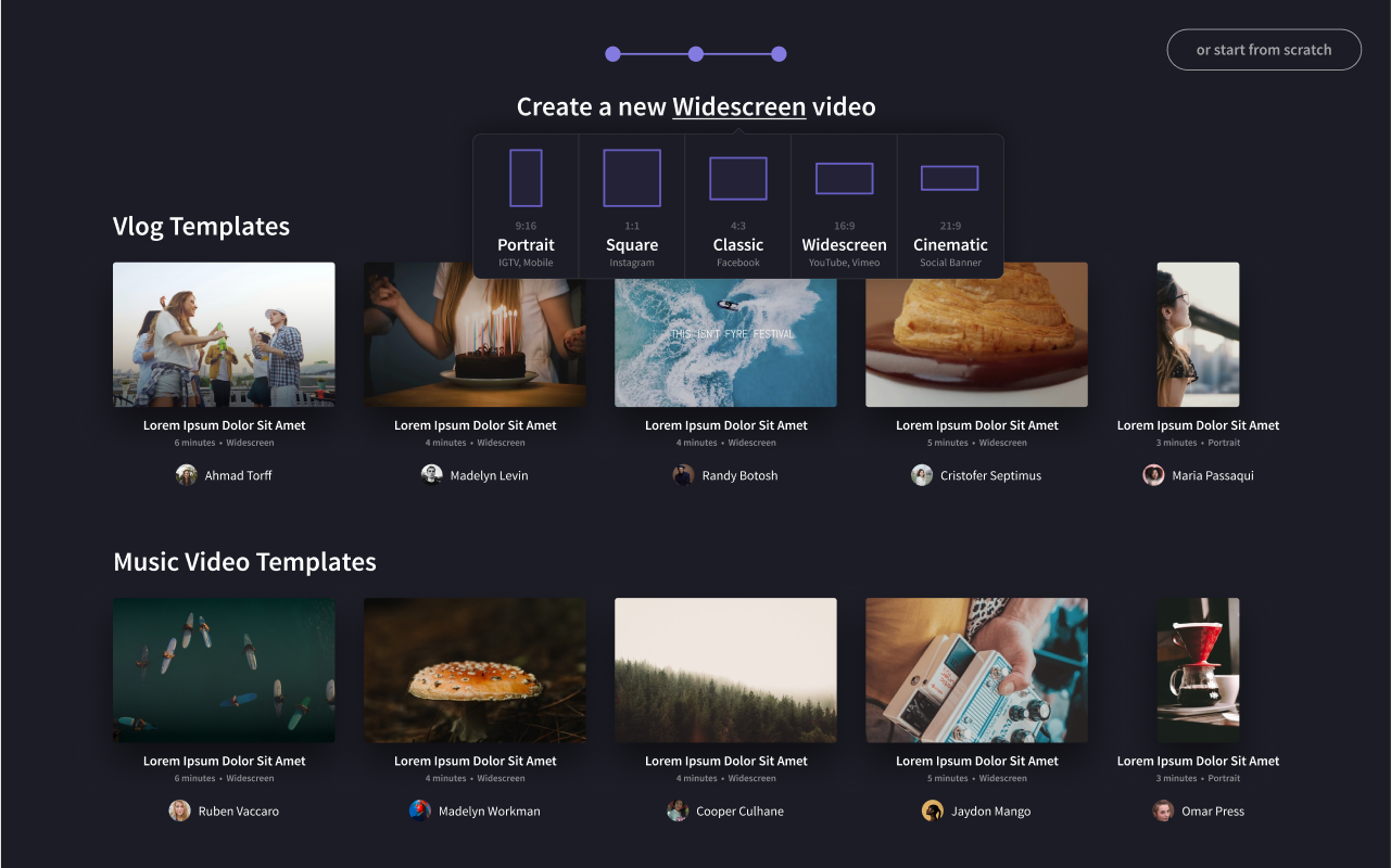
Before
After
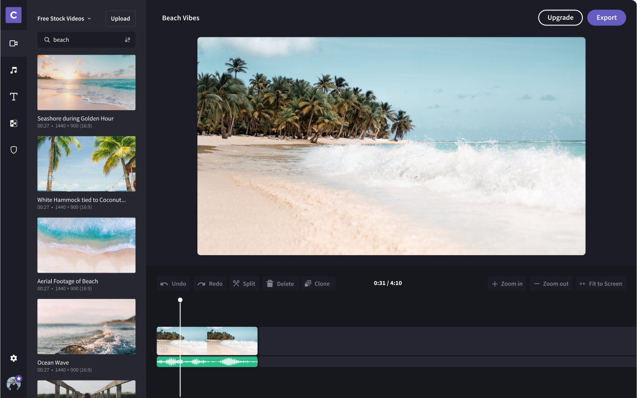
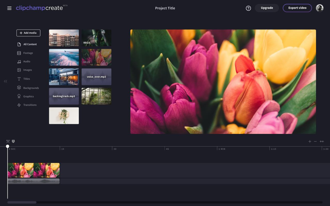
Editor Redesign
One of the fundamental issues with the video editor itself was the layout. Behavioural data collected by the Clipchamp team found that the UI (while beautiful) simply wasn't understandable by people who have never used a video editing platform before. After much research, we designed a major change for the editor.
The overall goal for the editor was simply a cleaner design with a better use of space. To get here, however, we'd need to address a whole slew of new and existing features to simplify the underlying architecture:
- Properties panel: only appears when interacting with a timeline item
- Filters: Standard Instagram-style filters designed to quickly add flair to your video.
- Hover-to-change: Hovering on options for filters, layouts, etc. would immediately update the editor, making it much quicker for a user to see which option they like the most.
- Cues: tooltips and visual indicators (e.g. drag-and-drop this thing to add it to the timeline) designed to improve product adoption.
- Hotkeys: keyboard shortcuts for common actions, as well as a visual indicator to help users learn new hotkeys.
- Picture-in-picture: layering a video on another video, helpful for Youtubers doing reviews or gamers.
- Drag helpers: Clipchamp track rows can only take one type of media at a time, so we added a visual indicator for available space when you're dragging in new media.
- Premium labels: We introduced stars as a visual language element to signify something Premium. This helps tie together things like high resolution exports, paid stock assets, branding and other features that require an upgraded Clipchamp account.
Before
After
Other
While that's probably enough for one case study, I was also fortunate enough to work on a whole range of features:
- Various modals for Successful Upgrades, Errors, Download Notifications, Upselling, etc.
- Tagging: adding freeform labels to your video to find it easier in the Dashboard, helpful for pro users.
- Various account and settings updates
- Motion Titles: Animated text
- Smart resizing: an automatic aspect ratio adjuster with smart cropping, designed to help traditional landscape users enter the mobile video market easier. Came with a lot of questions: How does changing aspect ratio work in the editor? Should we even pick dimensions at the start? How would cropping / letterboxing work? etc.
- Cloud Sync: a feature that would allow users to backup their own files easily and securely, as well as foster an ongoing relationship with Google and Dropbox. This included in-app sync functionality and integration with native desktop apps (right-click > Dropbox > open in Clipchamp)
- Automatic Logo Placement Guides: an automatic logo placement system based on constraints and rules, designed to help our users create a professional-looking branded video without the hassle of resizing and positioning. Created dynamic dimension-based guidelines utilising a bounding-box system for square, landscape, portrait logos on square, landscape and portrait videos.
- Block-driven video assembly: we toyed with the concept of introducing a simple, block-based video system like Biteable or Vimeo Create.
- Navigation: designed a navigation system that reduced the existing combination of panels, sidebars and navbars into a single, consistent component designed to be usable across the entire Clipchamp experience.
- Projects: addressing organisation of projects (folders vs. tags) and how this impacts the overall experience. Figuring out how we can consistently navigate around the platform, how we can assist with search, surfacing recent projects.
Outcome
While I wasn't able to gather the metrics of all the experiments, some of the earlier ones already have solid results:
- Changes to the Pricing Model and Checkout experience resulted in 30% increase in checkout conversion.
- The new sidebar recently rolled out, so far content adoption is up 20%.
- Overall we accelerated user base by at least 20% in a 3-month timeframe.
We also achieved some some great non-KPI outcomes...
- They are now the default video editor on Chromebook and is promoted frequently by Google
- They have a solid partnership with Dropbox
- We reduced overall "blank canvas fear" for users through our efforts on onboarding and video creation
- Hotkeys received highly positive feedback from pro users, saying it greatly increased how quickly they make new videos
Learnings
The biggest learning from this project was definitely around how to work effectively as a team in ongoing design sprints. The time constraints meant that there wasn't a lot of room for awaiting feedback or trying out a whole slew of directions, so I learnt pretty quickly what's needed to facilitate a culture of constant learning, ideating and shipping.
Additionally, it was great experience for presenting our work and findings to the larger team. As mentioned earlier, every Friday we presented our work to the wider team, covering our process, insights, learnings, work and solutions for the week. Anna and I worked together on preparing the deck every Thursday and over time, learned the best way of visualising and formatting raw data and insights to make them inherently understandable and useful by the management, product and sales teams.
While the lean and highly iterative approach worked well for Clipchamp's short-term goals, it did have an obvious effect on the long-term scalability of the product design ecosystem. Most of the features I'd worked on are currently being built upon in isolation, without a design system or even consistent styleguide to encourage consistency. While a design sprint style approach is great for solving problems quickly and iteratively, it shouldn't be used as a permanent solution for product design.
Final Thoughts
Working with the Clipchamp team was a fantastic experience and I loved every minute of it. I also occasionally get personal emails to my Jellypepper email from Clipchamp customers saying how much they love the changes which is strange to hear from a third-party perspective but it's super nice to hear, so I forward these to the Clipchamp team.
References
Working with Hayden on multiple projects and having such a tight collaboration with him always led to fantastic results. We were all one team working on a product together from start to finish.
— Sören Balko, Co-Founder and CTO of Clipchamp
Hayden was an invaluable resource and proved to naturally augment our design team while it was growing. We were thrilled with the concepts he produced in getting our product experiments and features to market.
— Anna Ji, Head of Product at Clipchamp